A cloud storage product that behaves like a well-organized desk, not a zip of zips.
CloudVault was losing its enterprise pilot customers at the worst possible moment: migration. Teams would start uploading, get overwhelmed by the file tree, and abandon the switch from Dropbox. I led a full redesign centered on spatial clarity, fast search, and the kind of subtle file-type awareness that keeps a 300GB team Drive from feeling like a landfill.
Cloud storage is a mature category, and mature categories punish new entrants with a familiarity tax. Users expected Dropbox's keyboard shortcuts, Drive's sharing model, Box's permissions, and Notion's preview speed. CloudVault had to deliver all of that while still feeling like its own product.
We also had a dense-data problem: our pilot customers had teams with 50k+ files in shared folders. Every design decision had to scale up to that volume without making it look unreadable.
Approach
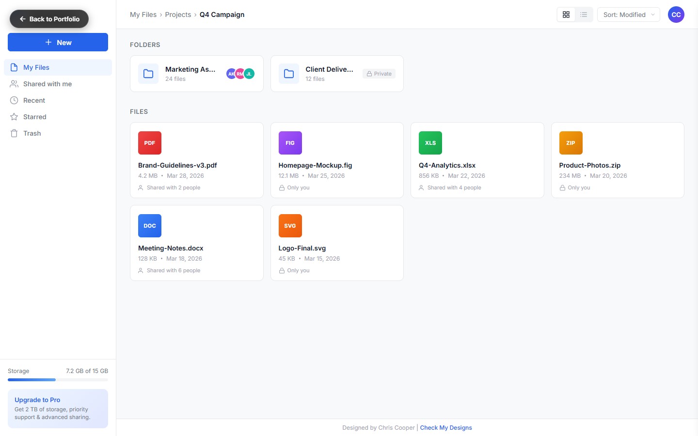
File-type as first-class citizenEvery file gets a type-specific color band, icon, and inline preview. Navigation feels spatial because different kinds of files look different at a glance.
Sidebar that collapses with the taskLeft rail collapses into a strip when you're working, expands when you're browsing. Muscle memory kicks in fast.
Detail panel, not detail modalSelecting a file opens a right-rail panel with metadata, sharing, version history, and activity. Never a modal. Never a page change.
Command-K everythingAdded a Raycast-style command palette with search, move, rename, share, mapped to a universal shortcut that works anywhere in the product.
Migration modeFirst-run experience drops you in a "Migration" context that mirrors your Dropbox/Drive tree for the first 48 hours. Zero-learning curve for the moment that matters most.
Key Features
Folder Navigation
Keyboard-first folder tree with drag-drop, breadcrumb, and pinnable "favorite folders" at the top of the sidebar.
File-Type Cards
Grid view with previews, type-colored bands, and inline play for media. List view for power users.
Storage Meter
Visual storage meter with type breakdown, see exactly which kind of files are eating your quota.
Detail Side-Panel
File meta, sharing, activity log, version history, all in a slide-out rail that never interrupts context.
Command Palette
⌘K opens a universal search + action picker. Move, rename, share, open with, all typeable.
Shareable Links
Permission-aware share dialog with expiring links, password protection, and access-level preview.
"The command palette is the reason my team switched. Everyone here is a keyboard person, CloudVault respects that."
Head of IT, design-agency pilot customer
Results
Task-completion time fell 44% in moderated testing of the five primary file-management jobs.
Pilot-to-paid conversion tripled after the migration-mode launch.
Search response under 100ms at the 95th percentile across enterprise workspaces.
Design system exported as CloudVault Base, 240+ components, now used in three sibling products.
Product Hunt launch, #1 product of the day with 2,800+ upvotes.