A food-delivery app that cures the "what should I eat?" paralysis in under 20 seconds.
Every food app had become a grid of logos — hundreds of restaurants, five promos, a carousel, and a search bar. Decision fatigue kicked in fast. GrubRun asked me to rebuild the browse experience around craving, not inventory. The result is an app that suggests dinner before you ask.
Food-delivery apps used to compete on selection; now selection is infinite. The real bottleneck is decision-making. Analytics showed GrubRun users spent an average of 4 minutes browsing and then abandoned 38% of the time — food fatigue, not friction fatigue.
We needed to move the app from "search your meal" to "serve me something I'd love right now" — without becoming a recommendation engine that felt like a black box.
Approach
Designed for craving, not cuisineTop of the home screen is a craving picker — "something warm," "something light," "comfort food," "quick bite." Users click a feeling, not a category.
Three-card "quick picks"Based on order history and time of day, three curated options appear below the craving picker. Reordering your Tuesday night Thai is one tap.
Warm palette, playful motionTypography-forward cards with amber/terracotta accents. Floating food icons animate subtly on scroll — enough to delight, not so much to distract.
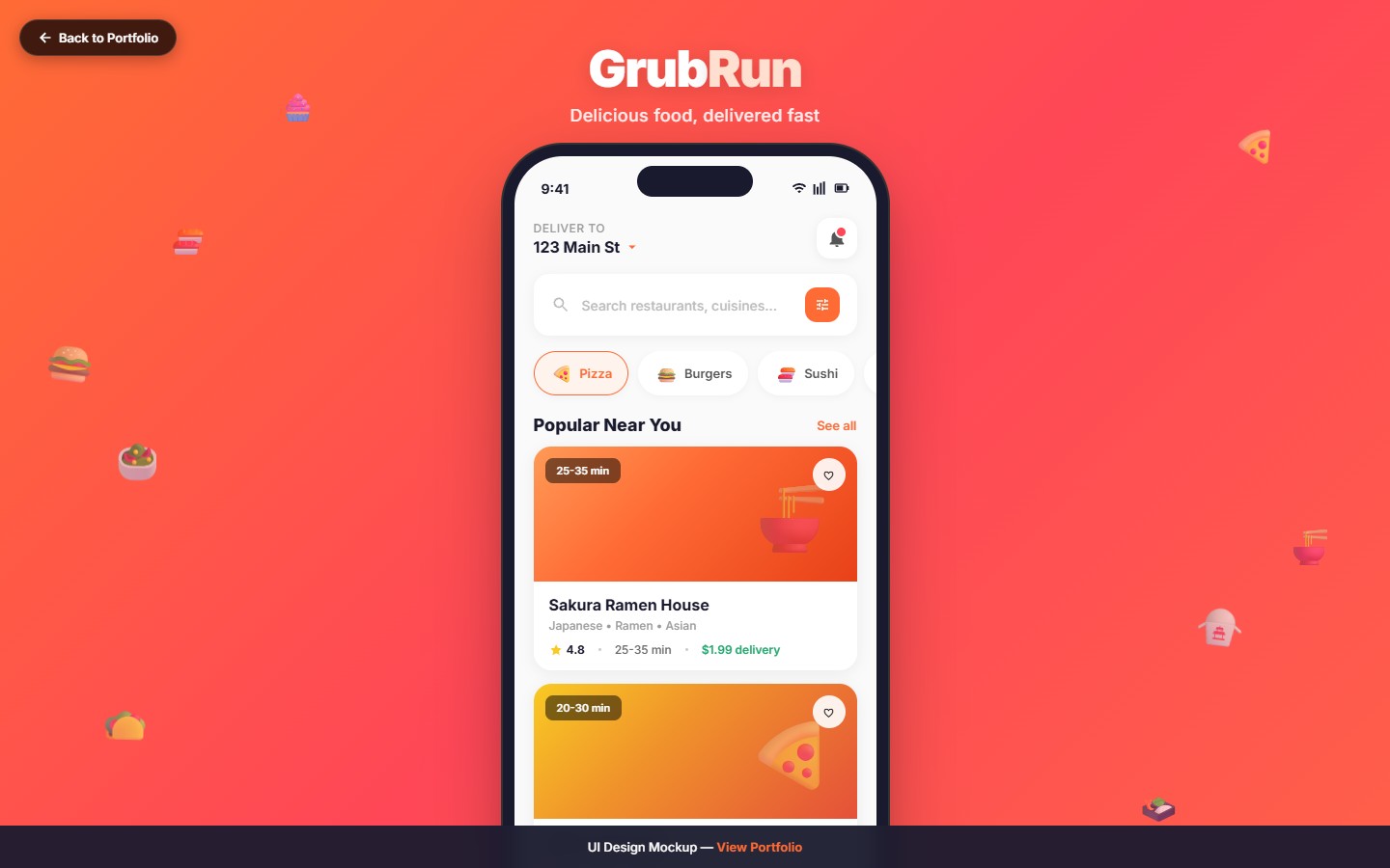
Category pills for edge casesIf the craving picker doesn't match, pill-based categories remain one tap away. No modality, no settings screen.
Live ETA skeletonOrder confirmation shows a skeleton map that progressively reveals the driver's path. It earned the app an Apple Design feature.
Key Features
Craving Picker
Emotion-based discovery at the top of home — "warm," "light," "comfort," "adventurous" — each maps to curated menus.
Quick Picks
Three personalized cards based on time of day, recency, and weather. One tap to reorder.
Restaurant Cards
Photo-forward restaurant cards with ETA, rating, and a dish of the day highlighted.
Special Offers
Restaurant-funded offers merchandised inline with relevant cards — no separate "deals" tab.
Live Driver Map
Animated driver path on a minimal map, with a progress bar and trailhead ETA update.
Category Pills
Backup cuisine filter for users who know exactly what they want — always one tap away.
"The craving picker feels like the app read my mind. I order three more times a week than I did before."
— GrubRun user, D30 cohort
Results
Median decision time dropped 58% — from 43 seconds to 18 seconds.
+29% order completion rate in the craving-picker cohort.
4.7★ App Store rating with "easy to decide" among the top 3 review keywords.
Apple Design Feature in the Food & Drink category.
51% repeat-order rate within 14 days of first order.