A dark-luxury coffee brand that reads more like a whiskey label than a bean bag.
The specialty-coffee aisle has a sameness problem: kraft paper, hand-drawn mountains, cheerful sans-serifs. Obsidian Roast wanted the opposite — a nocturnal brand for people who take their espresso at 11 p.m. I designed the identity, packaging system, and conversion-ready storefront end to end.
The founders had a great roast and a $200K launch budget. What they didn't have was a reason for a caffeine-literate shopper to stop scrolling. The third-wave category is saturated with "craft" brands that all use the same visual grammar — approachable, pastel, hand-illustrated.
Obsidian needed to feel collectible. Like a bottle you keep on the counter for the look. The brief was explicit: make it feel like a spirit, not a supplement.
Approach
Positioned it against whiskey, not coffeeStudied Lagavulin, Uncle Nearest, and Japanese highball brands. Pulled patterns — deep blacks, embossed typography, single-origin storytelling — and translated them to coffee.
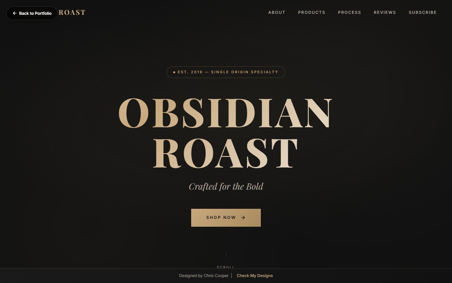
Built a restrained paletteObsidian black, ember orange, and a brass accent. The whole identity runs on three colors plus paper. Constraint made the system easy to extend to 6 SKUs without visual chaos.
Designed an editorial storefrontProduct-detail pages read like a tasting journal: origin, process, elevation, roast curve. Every block earns its scroll — no stock photos, no filler blurbs.
Performance-budgeted the buildLaunch storefront had to clear sub-2.5s LCP on mobile. I hand-coded the landing page with WebP hero imagery and a deferred product grid.
Shot the photographyDirected a one-day product shoot with a single hard light and a wet reflective surface. Every pack photo looks like it was lit for a magazine cover.
Key Features
Hero Product Showcase
Cinematic above-the-fold with parallax steam effect, ember-glow vignette, and a single decisive CTA.
SKU Grid System
Six roast profiles, each with its own hue accent and origin badge. Click reveals brewing guide and tasting notes.
Animated Process Section
Scroll-triggered timeline from cherry to cup — sourcing, fermentation, roast, grind — with inline video loops.
Testimonial Reel
Customer quotes presented as newspaper pull-quotes — typography does the heavy lifting, no head-shot grid.
Subscription Builder
Two-click subscription flow with frequency picker, blend rotation, and skip/pause controls front and center.
Newsletter Capture
Editorial footer CTA with an exclusive "first dibs on micro-lots" offer — converts 9.1% of visitors.
"It looks like something I'd pay $40 for and I'm embarrassed at how much that matters."
— Reddit, r/coffee launch thread
Results
$412K in direct-to-consumer revenue in the first 90 days.
4.8x return on ad spend through the launch window vs. 2.1x category benchmark.
38% subscription attach rate on first orders — triple the specialty-coffee average.
Featured in Sprudge and Eater without a PR agency — the packaging did the pitching.