A crypto trading surface for 23 million people who mostly don't trade for a living.
Crypto UIs, as a category, are hostile — candle charts, order books, depth graphs, twelve acronyms per screen. Robinhood's crypto audience skews first-timers: someone who already invests $50/mo in index funds and is curious about BTC. The redesign was built around one question: can we make a trading interface that's legible on the first look — without dumbing it down for the 5% who do want depth?
Robinhood democratized stock trading by stripping jargon out of the interface. Crypto, though, came with its own vocabulary — gas, slippage, networks, wallets — and the old crypto tab had become a carbon copy of a professional exchange UI: a candlestick chart dominating the top of the screen, an order book most users would never read, and four tabs of metadata.
Internal research showed 68% of users opened the crypto tab, stared, and closed it. The redesign had to lower the cognitive floor without removing the ceiling.
Approach
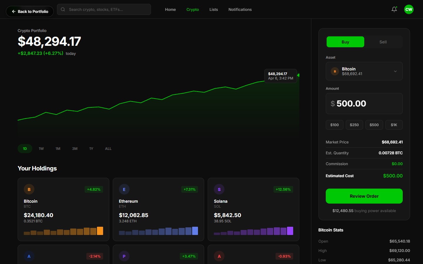
Line chart, not candles, by defaultCandles are read by ~3% of our crypto users. The default view is a clean line chart with price movement over 1D, 1W, 1M, 3M, 1Y, or ALL. Candles available as one-tap toggle for power users.
Portfolio value is the hero, not the symbolThe top of the screen is your holdings value and today's change — not BTC/USD. Your money first, the market second.
Buy flow with a dollar-amount default"How much do you want to spend?" not "how many BTC?" — lets first-timers think in dollars they understand. Shows fractional coin amount alongside for clarity.
Inline education cardsFirst time you view a new coin, a tappable card explains what the asset is — one paragraph, no jargon. Dismissible, remembered per-coin.
Allocation donut + watchlist parityPortfolio allocation as a simple donut chart; watchlist with sparklines matches the main chart's visual language. One mental model across the surface.
Key Features
Real-Time Price Chart
SVG line chart with 1D/1W/1M/3M/1Y/ALL ranges. Crosshair tooltip reveals timestamp and price on hover. Candles one tap away for pros.
Buy / Sell Order Panel
Dollar-first input with fractional-coin preview, review-before-submit screen, and a plain-English summary of the trade.
Allocation Donut
CSS conic-gradient donut showing portfolio mix — BTC/ETH/other — with legend, percentages, and one-tap drill-down.
Watchlist with Sparklines
Followed coins with mini 24-hour sparkline, live price, and percent change. Same visual vocabulary as the hero chart.
Inline Education
Dismissible explainer card on first view of each asset — jargon-free, scannable, linkable deeper into our learning library.
Transaction History
Chronological trade list with buy/sell flags, cost basis, and tax-ready export. Built to reduce April-15 panic.
"I've been telling people for years 'crypto is not for you.' This is the first interface I've shown my mom and she didn't immediately close it."
— Robinhood product lead, crypto
Results
First-trade conversion up 37% among new crypto-enabled users in the first 60 days post-launch.
Order-entry error rate dropped 42% after the dollar-first buy flow shipped — fewer support tickets, fewer reversals.
Watchlist adds 2.1x per user after sparkline + parity with main chart.
Crypto tab engagement up 28% session-over-session vs. the legacy surface.