A product-analytics dashboard that answers the question, not just displays the data.
Zenith's analytics platform had every metric a SaaS team could want — and that was the problem. Eight tabs, 40 charts, zero direction. I led the redesign around a single principle: surface the answer first, the raw data second. The result is a dashboard that a Series C operator can scan in 30 seconds and act on before their coffee cools.
Zenith was losing customers at renewal because users weren't using it enough to see the value. The analytics logs told a grim story: power users spent 40 minutes a week in the product; casual users, 4 minutes. That 10x gap was entirely about orientation — casual users couldn't find their way to the one chart that mattered for their job.
The redesign brief was ruthless: reduce time-to-first-insight by 50% without removing power-user capability. Those two goals are usually at war.
Approach
Role-based landingA PM, a growth lead, and a founder need different "first screens." We mapped the three primary personas to three saved views — the app picks one based on org role.
Auto-generated insight cardsAt the top of every dashboard, a row of plain-English insight cards: "Trial-to-paid conversion is up 18% week over week." The numbers are always linked to the underlying chart.
Progressive disclosure of filtersBasic filters visible, advanced filters behind a single "More filters" affordance. Power users don't lose anything — they just don't hurt new users anymore.
Chart taxonomyConsolidated 140 chart variants into 9 base primitives with configurable skins. Design velocity went up 4x; the chart library now ships in the customer-facing SDK.
Storyboard workflowsUsers can pin charts into a scrollable "report" and share a read-only link. It became the #2 most-used feature within a month.
Key Features
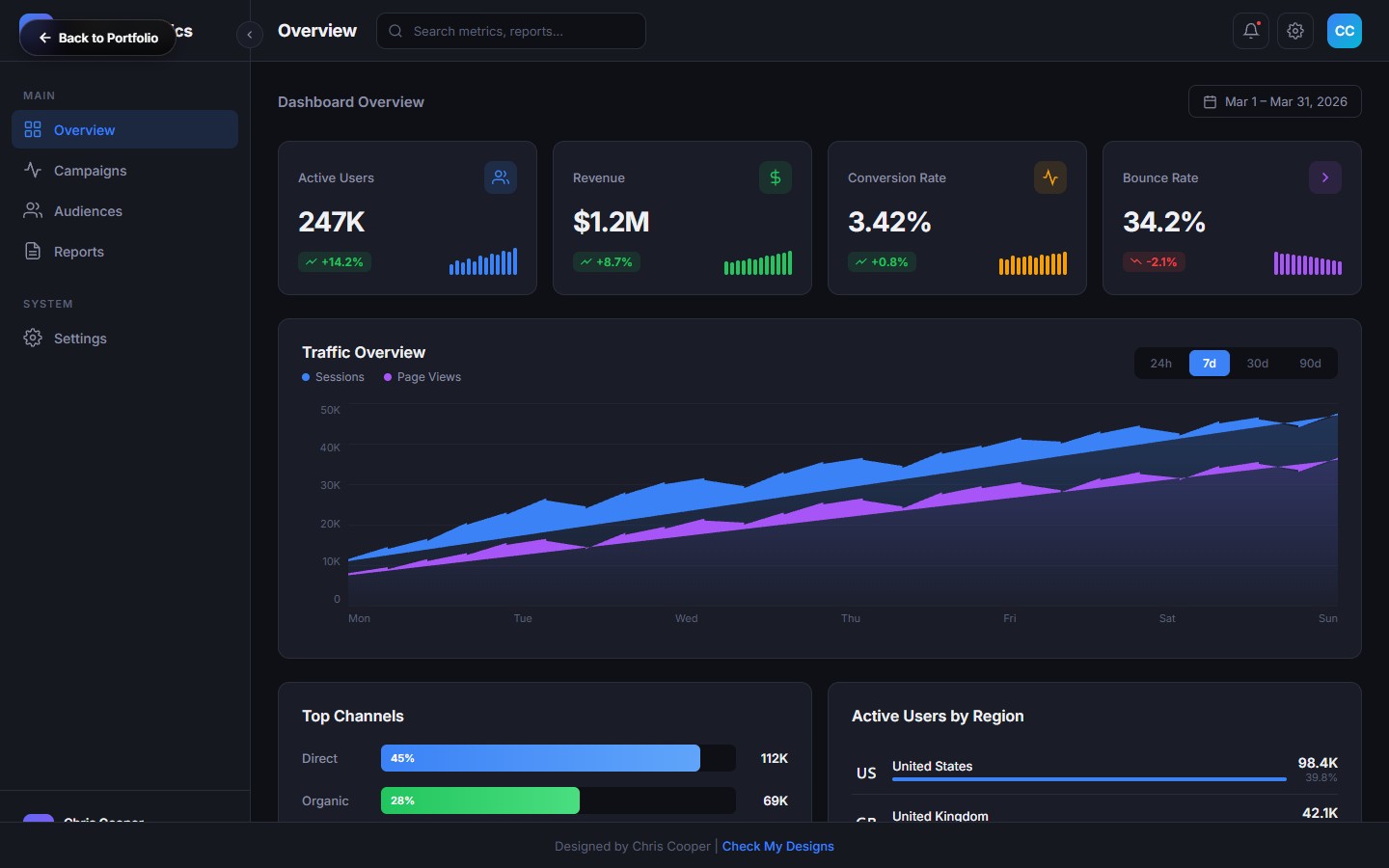
KPI Sparklines
Five headline metrics, each with a 30-day sparkline, delta chip, and one-click drill-down to the underlying event.
Traffic Area Chart
Smooth area chart with hover tooltip, segmented overlay, and annotated release markers for context.
Channel Breakdown
Acquisition channels as a stacked bar with compare-to-previous, attribution window picker, and export.
Regional Map
SVG world map with country-level user density, time-zone overlays, and a ranked regional leaderboard.
Activity Feed
Real-time event stream with smart grouping, user avatars, and a filter that carries across the dashboard.
Pinnable Reports
Drag any chart into a custom report, reorder, annotate, and share with a read-only link.
"The insight cards turned our Monday review from a data hunt into a decision meeting. That's a category shift."
— VP Product, Series C customer
Results
Time-to-first-insight dropped 73% for casual users (measured from login to chart interaction).
22% lift in trial-to-paid conversion tied directly to the new onboarding dashboard.
Weekly active use doubled across the casual-user segment.
Net-revenue retention climbed 8 points in the two quarters post-launch.
Design system shipped publicly as the Zenith Chart SDK, used by 40+ customers.